G’s Burger Joint took Waterloo by storm, popping up with stacked, smashed burgers and overflowing fries that locals couldn’t get enough of. Created by Gianni with a fun, community-first vibe, G’s quickly became the spot for bold flavours and big personality. From menus to logos, every detail—right down to the packaging—brought the brand’s energy to life. It may have been a pop-up, but G’s left a lasting impression, with fans still craving those unforgettable, mouthwatering stacks!
About G’s Burger Joint
How we helped?
1. Bold & Playful Branding
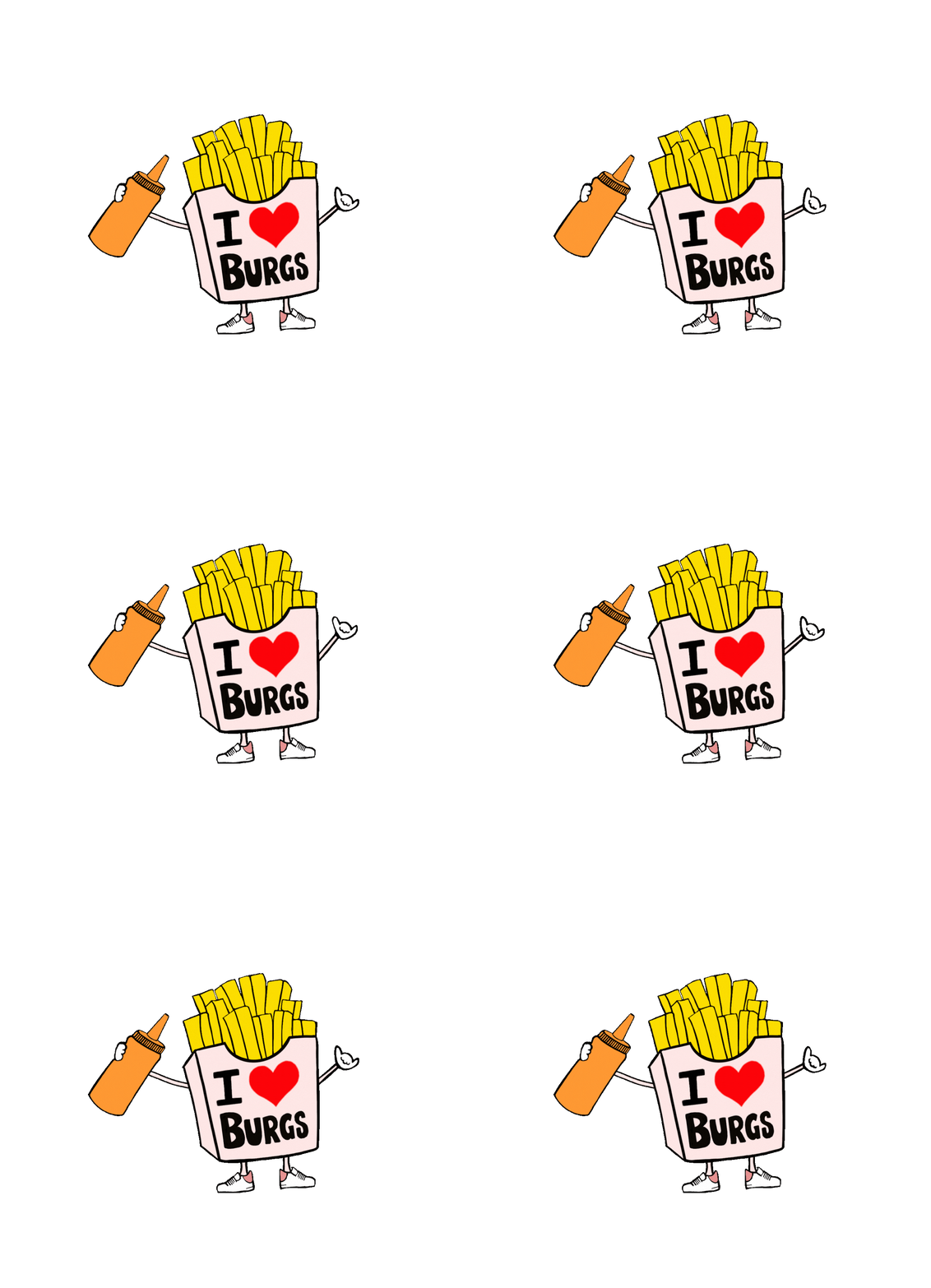
We kicked things off with G’s Burger Joint by designing a fun, character-driven brand from the ground up. The logo—a burger with sneakers and a fries girlfriend rocking an “I ❤️ Burgs” shirt—brought out the playful, street vibe Gianni envisioned. We tied it all together with ketchup-inspired typography and vibrant packaging, making G’s instantly recognizable and irresistibly fun.
2. Locals First Launch
Launching in Waterloo, we built a website that captured G’s personality and made online ordering a breeze. Social media took their brand further, with mouth-watering shots and playful reels highlighting what was on the menu that weekend, that kept the community coming in for their next burger fix.
3. Selling Out Nightly
With weekends only and pure organic effort, G’s quickly became a hit in the local scene. Through clever social posts, eye-catching flyers, and the irresistible draw of those stacked burgers, the community kept coming back for more. Most nights saw sellouts—a true testament to G’s cult following. And like all great pop-ups, it left on a high note, leaving locals craving its comeback.


